


Style Encapsulation in React, Revisited for 2026
In 2019 I wrote that CSS-in-JS was the answer to React’s styling problem (the original piece is still up on Medium if you want the unedited version). Developers were done arguing about BEM naming conventions, tired of specificity wars, and CSS-in-JS libraries like styled-components and Emotion looked like the future.
Seven years later, I’d tell a junior dev something almost the opposite. Not because I was wrong about the problem. Because the ecosystem answered it differently than I expected, and then AI tools answered it again, in a way nobody was really arguing for.
Here’s what held up, what didn’t, and what actually matters if you’re styling a React app in 2026.
CSS is still broken (this part aged fine)
The core problem from 2019 hasn’t changed. CSS was built for documents, not component trees, and it defaults to global scope. Write .button { color: blue } in one file and it can quietly override a .button class three folders away that has nothing to do with it. Specificity turns small style changes into archaeology. Dead CSS piles up because nobody’s confident enough to delete a class they can’t prove is unused.
Every solution to “style encapsulation” is really an answer to one question: how do I make sure my styles only affect what I meant them to affect?
What I recommended in 2019
Back then the field was BEM, inline styles, or CSS-in-JS.
BEM (Block, Element, Modifier) solved scope through naming discipline: .card__title--highlighted instead of .title. It worked, but it asked every developer on the team to follow a convention with no enforcement beyond code review, and the class names got ugly fast.
Inline styles solved scope for free, since a style attribute can’t leak, but you lost the cascade, pseudo-classes, and media queries, plus a real performance cost from recalculating styles on every render.
CSS-in-JS, which had shown up around 2014 and was hitting its stride by 2019, let you write real CSS scoped to a component using JavaScript. Styled Components was the flagship. I called it the direction things were heading. I was half right.
What actually happened between 2019 and 2026
Two things changed the calculus, and only one of them was really about CSS.
The first was React Server Components. Runtime CSS-in-JS libraries work by generating and injecting styles at render time in the browser. RSC and streaming SSR broke that assumption for a lot of apps, because a chunk of your component tree might never touch client-side JavaScript at all. styled-components didn’t die over this, but it went into maintenance mode, and it took until version 6.3.0, shipped this past January, to add real React Server Components support. That’s a six-year-old library patching in support for an architecture that reshaped the ecosystem around it.
The second was momentum. Weekly downloads tell the story: styled-components dropped from roughly 8.5 million to 6.8 million between 2023 and 2026, about a 20% decline. Tailwind CSS doubled in the same window, from 6 million to 12 million. Zero-runtime CSS-in-JS tools like Panda CSS grew even faster in percentage terms, from 80,000 to 200,000, a 150% jump from a much smaller base. (Source: the ecosystem shift breakdown on techinterview.org.)
The industry split the CSS-in-JS category in two. Runtime libraries (styled-components, Emotion) kept working but stopped being the default choice for new projects. Zero-runtime tools (vanilla-extract, Panda CSS, StyleX) kept the ergonomics, type safety, and theming that made CSS-in-JS appealing, but compiled everything to static CSS at build time, sidestepping the RSC problem entirely.
The 2026 verdict
If you’re picking a styling approach for a new React project today, here’s roughly how I’d think about it.
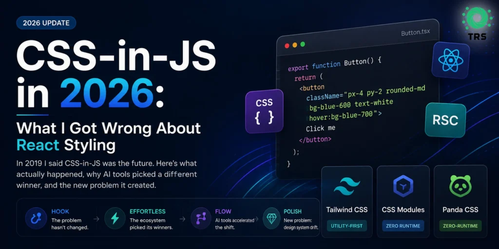
Tailwind is the default for most teams. Utility classes are scoped by construction (there’s no custom class to collide with anything), it works fine with Server Components since there’s no runtime, and the ecosystem around it (component libraries, editor tooling, AI code generation) is enormous.
function Button({ children }) {
  return (
    <button className="px-4 py-2 rounded-md bg-blue-600 text-white hover:bg-blue-700">
      {children}
    </button>
  );
}
CSS Modules are the right call if your team wants plain CSS with zero extra dependencies and build-tool-enforced scoping. Less abstraction, less to learn, still real stylesheets.
import styles from './Button.module.css';

function Button({ children }) {
  return <button className={styles.button}>{children}</button>;
}
Zero-runtime CSS-in-JS (Vanilla Extract, Panda CSS, StyleX) is worth it if you want type-safe styles, a real theming API, and the CSS-in-JS developer experience, without a runtime cost or an RSC headache.
// button.css.ts
import { style } from '@vanilla-extract/css';

export const button = style({
  padding: '8px 16px',
  borderRadius: '6px',
  background: '#2563eb',
  color: 'white',
  ':hover': { background: '#1d4ed8' },
});
Runtime CSS-in-JS still has a place in codebases already built on it, especially ones that aren’t adopting Server Components. Ripping it out for its own sake usually isn’t worth the churn.
The real reason nobody’s arguing about this anymore
Here’s the part that actually changed my thinking, and it’s not on the list above.
Most new React code isn’t written by a developer choosing a styling approach anymore. It’s generated. v0, Lovable, and Cursor paired with shadcn/ui have converged on the same stack: React, Tailwind, and prebuilt components. Ask any of them for a button and you get utility classes, every time.
That’s not because the CSS-in-JS debate got resolved on technical merit. It’s because Tailwind is the path of least resistance for a language model. No separate stylesheet to track across a conversation, no class-naming decisions to get consistent, and it’s overwhelmingly the majority pattern in whatever these models were trained on. The encapsulation problem I wrote about in 2019 didn’t get solved by AI. It got sidestepped, because inline utility classes can’t leak by definition.
But the underlying disease from 2019, no single source of truth for your styles, didn’t go away. It just moved. Teams building with AI tools are running into “design system drift”: the same component coming out with slightly different padding in two different chat sessions, because the model has no persistent memory of what value it used last time. 16px arrives as 15px or 17px because it looked about right. A button built on Monday and rebuilt on Wednesday quietly disagree with each other, and nobody notices until a designer does a side-by-side and asks why nothing lines up.
The fix isn’t picking a better CSS methodology. It’s giving the AI something to be consistent against: a design token file, actually referenced in the prompt or the project’s rules, instead of letting the model guess from the statistical average of every UI it’s ever seen. Same lesson as 2019. No source of truth means chaos. It just used to show up as .button clashing with another .button, and now it shows up as a spacing scale that drifts a pixel at a time.
What I’d tell 2019-me
Pick Tailwind or CSS Modules by default, reach for zero-runtime CSS-in-JS when you want the ergonomics, and stop treating this as a debate that needs winning. It already got settled, mostly by accident, mostly by tooling that wasn’t trying to settle it. The interesting problem in 2026 isn’t which styling library to pick. It’s making sure the thing generating your components, human or otherwise, has a real source of truth to work from.